Better Canada Initiative is a non-partisan, nonprofit organization that aims to be the civil-society place where all Canadians can discuss, understand and articulate public policy information in Canada. Their focus is on drafting and writing up policies that have been discussed to share with key stakeholders in Canadian politics for the betterment of the nation.
Art Direction: Deborah Lau-Yu, Palettera Inc.
My Role: Lead Graphic Designer
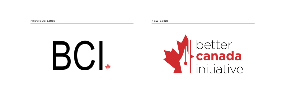
Their previous branding was not distinct and did not reflect the organization’s values or activities. Through explorations, we strived to better embody BCI through the use of both conceptual and literal symbolism.
The final logo for Better Canada Initiative is a graphic representation of their focus on writing and drafting for the betterment of the country.
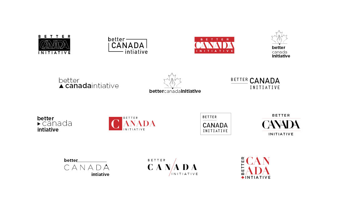
Sample of initial explorations.
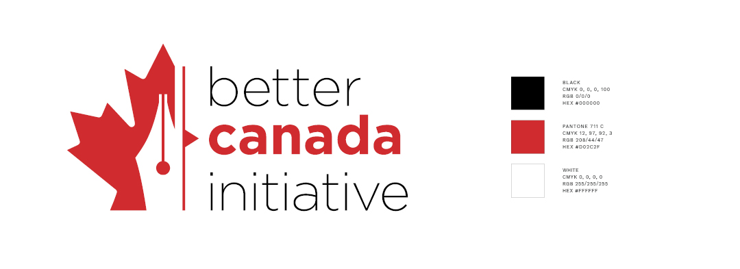
The image of a traditional pen nib is encased within the maple leaf, the national symbol of the country of Canada. These two visual symbols are united to create an unmistakable silhouette that stands strong besides the name of the organization.
Flanking the pen and maple leaf is an abstract symbol reminiscent of the editing symbol used to insert a word or phrase within a pre-existing sentence. It's use here is not only to emphasize BCI's focus on Canada but also specifically in regards to BCI's goal of improving the country.
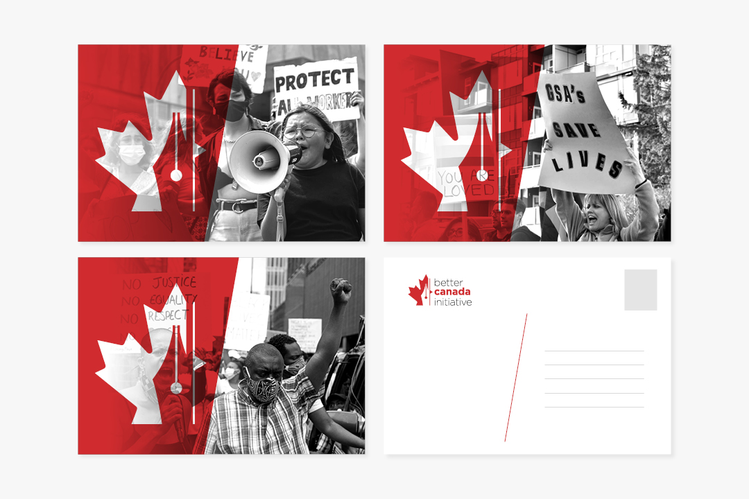
The logo as seen applied on promotional materials.
The logo was designed to be versatile and bold in its usage. The icon can be used alone to highlight powerful imagery that represents the organization’s goals of positive civic change through writing policies.