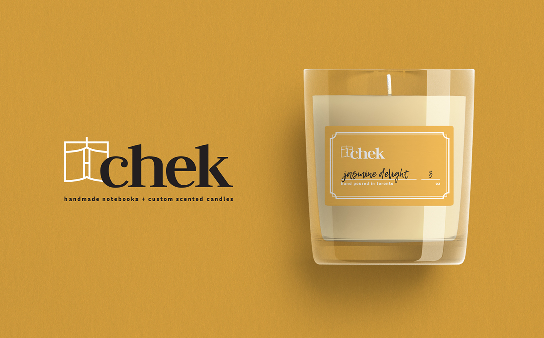
Chek is created by the client to channel her hobbies of bookbinding and candle-making into a potential profession.
One of the biggest challenges of this project was that the client had a very tight budget for the design of the brand as it was a small local business just starting out. To adhere to the budget, I worked closely with the client at each step to ensure we were going in the right design direction.
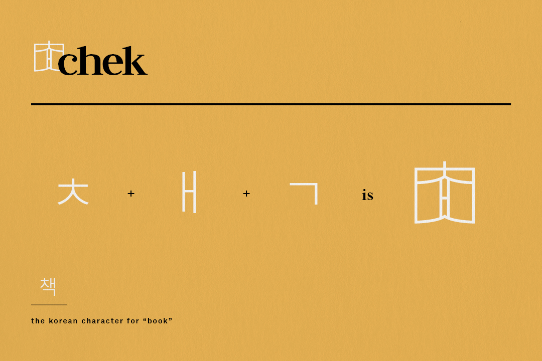
The story behind the book.
The client wanted to honour her Korean roots by incorporating the Korean character for “book” into the foundation of her business. The logo was designed to have the parts of the character come together to form a symbol that resembled both a notebook or a candle.
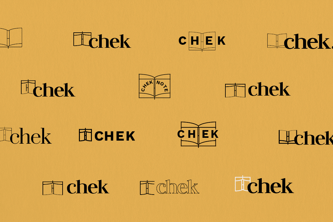
Numerous iterations were quickly created to find the perfect balance for how obvious the characters were to be.
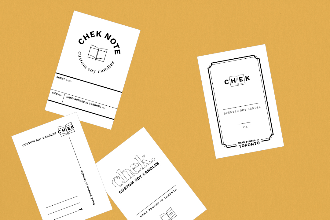
As each candle would be custom-made for the customer, the labels had to allow for personalization of the scent and the size.
Mock ups for candle labels were created to apply the branding. As her core products were notebooks and candles, I explored visual directions that were reminiscent of bookmaking such as library borrow cards, bookplates and student notebooks.
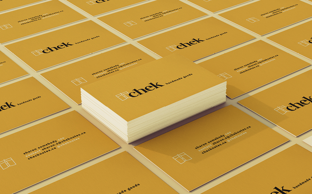

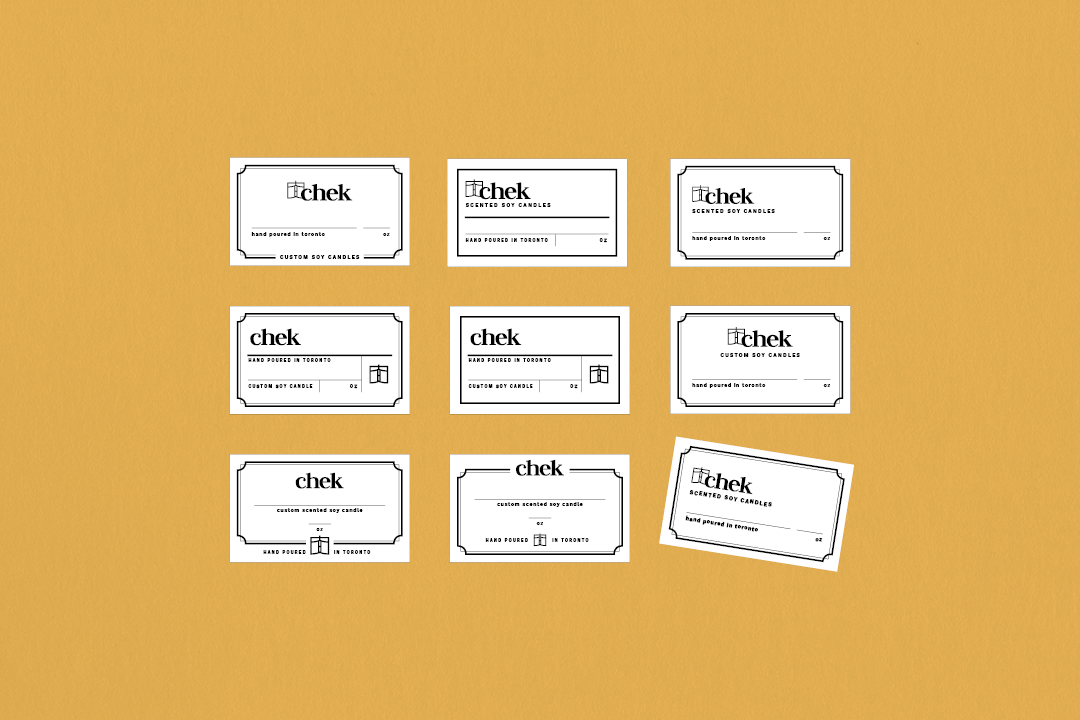
The branding as applied onto other products.
The project was completed within the limited budget and despite the quick turnaround time, the branding created a professional foundation for a local small business that was designed with growth in mind.