Strawberry Queen is an experimental display typeface created to challenge the stereotypical female image.
It is named after a pageant held in Tampa Bay, Florida of the same name.
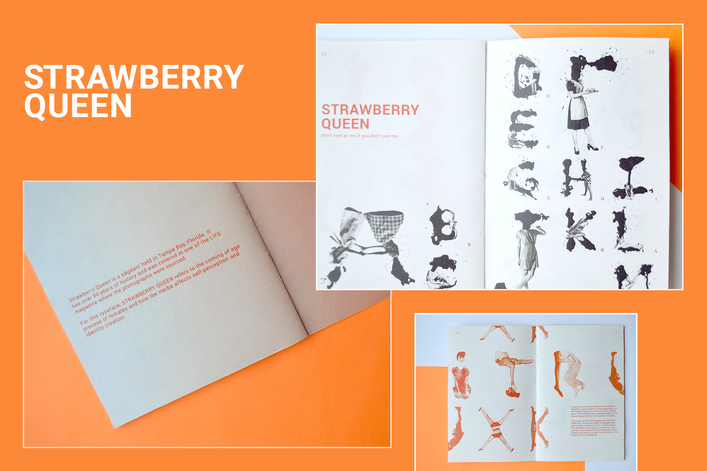
An accompanying hand-bound booklet was created to document the process and iterations.
Combining analog mixed media techniques and digital image manipulation, this typeface is a visual exploration of the coming of age process of females and how popular culture affects self-perception and the formation of personal identity.
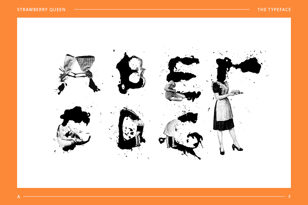
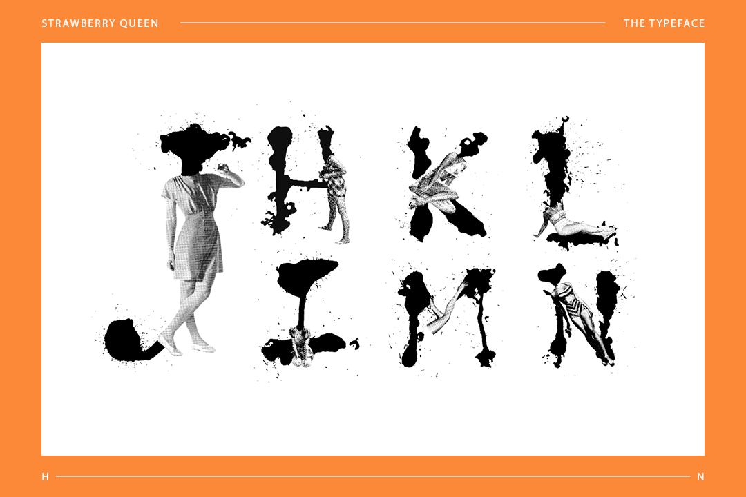
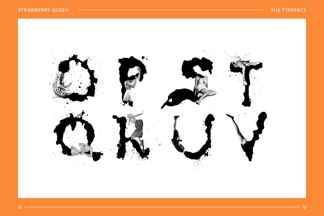
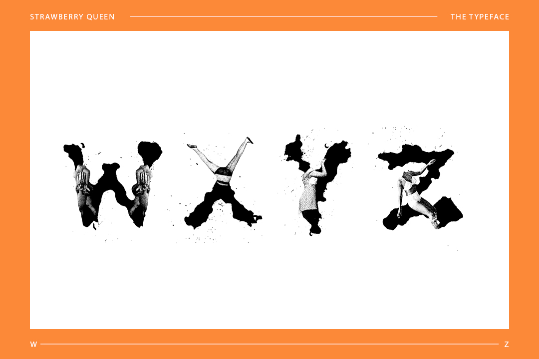
Inspired by how humanist typefaces were based on the proportions of the human figure, I took that idea literally and applied that to the letterforms. By choosing to use found human forms from various sources as the base of the letters, I was able to focus on studying the way females were depicted in photography, and by extension society’s expectations of women.
Faces and other identifying features were omitted from the magazine cut-outs and instead, replaced with organic ink forms to show a constantly changing idea of personal identities, especially when bombarded with media. The collage technique is also a reference to non-conformist aesthetics that is meant to be loud and jarring at a glance.
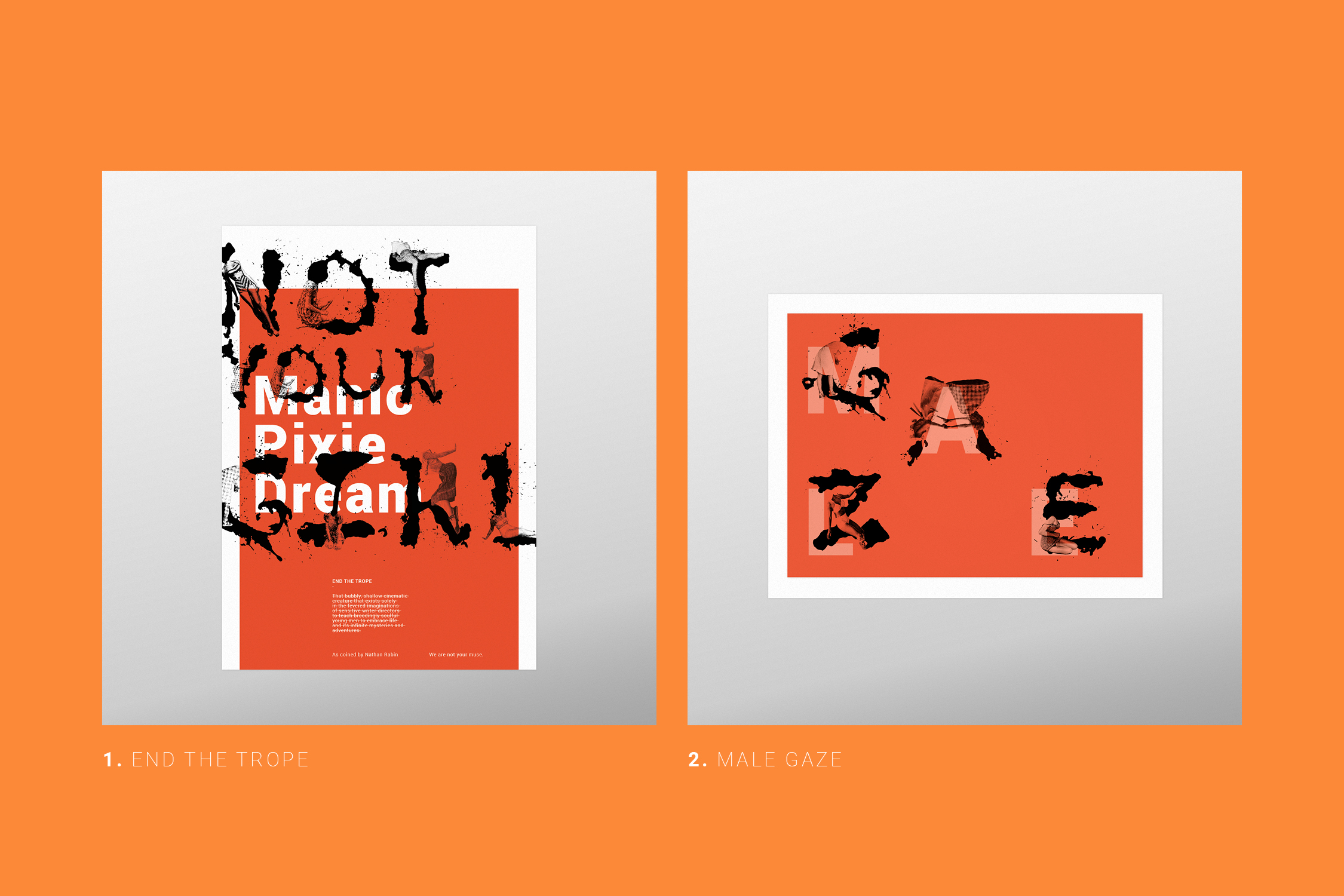
Sample applications of the display typeface in posters that address issues female representation face in media.